ISCOS
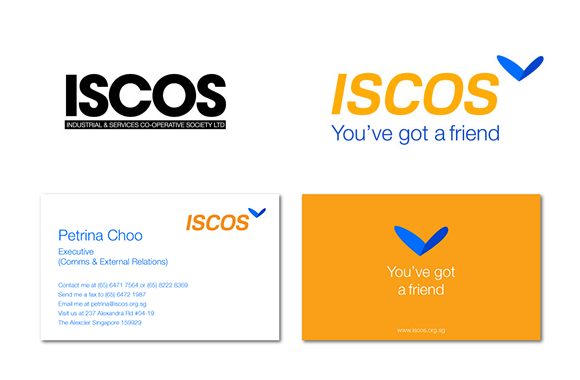
What started as a redesign of the logo soon turned into a self-reflection exercise of what it meant to be a part of ISCOS.

ISCOS is a Co-operative with a mission to help ex-offenders and their families. Established in 1989, it has now over 14,000 ex-offender members who have benefited from various programmes and initiatives, from employment and skills training, support and guidance in the community, and other social services.
Through the Yellow Ribbon Fund-ISCOS Fairy Godparent Programme (FGP), ISCOS aims to break the cycle of inter-generational offending by helping families of ex-offenders, particularly young and impressionable children. FGP is anchored on three key components: Student Development, Family Support and Home Environment. The programme provides the children with opportunities to achieve their academic potential so that in the future, they will become contributing members of our society.
What started as a redesign of the logo soon turned into a self-reflection exercise of what it meant to be a part of ISCOS. There are numerous stories that attest to this meaningful relationship – of a volunteer who changed his perspective after he was invited to a dining event in prison, of an ex-offender who remained a loyal friend after a volunteer helped him. These stories of friendship are a familiar refrain to us who serve at ISCOS, but unknown to outsiders.
The Spirit of Friendship
Much like the people behind ISCOS, the new brand identity reflects the spirit of friendship by combining wings and a heart. The overall experience represents freedom, care and life that ISCOS aims to be for the community of ex-offenders. It reflects the forward-looking mission of ISCOS in thinking ahead of the interests of ex-offenders. The wings also suggest the role of ISCOS in helping ex-offenders find a better future, while the symbol of the heart represents care and dedication.
The colours of the new identity have been chosen to reflect the positive energy at ISCOS. Blue represents the sky, while yellow with a gold tint represents the dawn of a new day. The play of two blues adds the element of movement through shadow, and is presented at an angle.

Need to realign your organisation?
We can help your company identify a unique purpose and build a strong collaborative culture.

