Few people will dispute the power of a great logo, yet so many are poorly designed in Asia, limiting its role in projecting soft power. Since ancient times, political powers and religions have used symbols and icons to shape the perception of value, power and divinity. These uniquely designed symbols were the only ways to communicate succinctly over vast distances. Citizens in far-flung provinces of ancient Rome would be informed of the change in power by noticing whose head it is on the Roman denarius, while missionaries of different faiths would travel the world and tell everyone what their symbols meant. In our time, you can block off parts of the Coca-cola can and people would still recognise it. How about the Nike tick or even the star of Mont Blanc? In fact, logos are so important that the most powerful brands will not change them, fearing that customers won’t recognise them. So if these symbols are so important then why has so little effort been made to create more recognisable Asian logos?
1st Challenge: Poor faith in the Asian Identity
The dominance of Western brands in luxury, food, beverages and technology has shaped the way we perceive design in Asia, so much so that many Asian owners when developing new brands, look to these Western logos and imitate them. They fear losing market share because if they were to design them differently, people might not want to pay more. The lost opportunity here is that logos are meant to be different so that customers can associate them with the business and build a relationship. It is not meant to reinforce someone else’s identity but to build yours. Poor understanding of this has led to lost business opportunities. It is also a pity that few Asian brands realise that it is harder to trademark if they are too close to a Western logo and that symbols inspired by Asian cultures are more unique thus easier to protect and own.
2nd Challenge: Poor Execution
In many markets in Asia, Western logos appear on our billboards and shelves. So when Asian owners begin to think about designing a logo, they tend to look at these examples around them and start to think that their teenage child can design them too. So the approach is usually to find any advertising agency, ask them to provide a hundred options and then go with something based on what feels right with the least amount of investment. Unfortunately, the same logo will appear on the company’s products and signages for years. But a good logo must also express the purpose of the brand succinctly and you need a good understanding of business and design to achieve that. Any logo that is not able to present a business proposition clearly and in a relevant way will fail to add any business advantage.
3rd Challenge: Poor Communication
The internet has been a boon to emerging Asian brands. It is now cheaper and more efficient to influence and build followers for your symbol. But few Asian companies are able to take full advantage of the Internet in influencing others because they lack the stories to do that. They have symbols without meaning and they offer only proposals with little vision limiting the development of a meaningful relationship with customers. It is like having a national flag and being unable to articulate what your flag means. If your employees and top management don’t even know the meaning of their logo, how can you expect your customers to love and endear themselves to the brand?
As Asia rises, it is important to overcome these basic challenges and maximise revenue and influence opportunities. There is nothing to stop Asian firms from designing influential symbols and signs. It is a self-inflicted wound and more due to the lack of a proper strategy to maximise brand influence through a uniquely designed logo. Here are 3 steps to ensure that you will have a powerful symbol to move mountains:
1st step: For uniqueness, start with a meaningful rationale
Before you begin to design any logo, write down what you would like to achieve with it. In our work, prior to designing the logo, we spend 1 to 3 months studying the organisation, looking out for any unique words used by management and staff, identify any special symbols that they may have been using. It has always been a treasure trove as few organisations realise how rich they are in terms of culture and way of thinking. Many a times when we present these research findings, the faces of management and staff light up as they recognise these unique words and symbols. The only thing is, they have never spent time to review and reflect on these internal assets until now. Together with the visual research, it is then important to link it with the purpose of their business and beliefs. At the end of the day, a great logo must reflect the identity of the organisation and not the vanity of the designer.
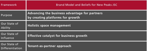
When we journeyed with New Peaks Real Estate Service JSC, a grade A real estate management firm in Vietnam, this is what we set out to do. We spent time in understanding their beliefs, their strengths and put together the following brand statement (see table below) so as to act as a guide for the client and for our designers to develop the visual solution.

The statement guiding the development of the logo was based on Consulus’s 3-State Methodology. SOURCE: Consulus
This statement is very important because it sets up the framework so that any solution will be faithful to the identity of the organisation.
2nd step: For effectiveness, it has to be distinct and recognisable
Unlike an advertisement, where you can put in a dramatic picture and then follow up with text or copy to explain yourself, you cannot do that with a logo. You cannot put too many elements into a logo as it is meant to suggest or trigger an association. At the same time, you have to keep a lookout on what the competition is doing, how do their logos look like and what colours and fonts they use. These are things that an inexperienced professional will not be familiar with. Logos should also not be too trend-based as they have to last for at least 50 years or more. All these factors make designing a logo a highly intellectually challenging exercise. A great logo is akin to the best elevator’s pitch ever. The difference is, it has to work within 3 seconds. Either you can recognise it or not.
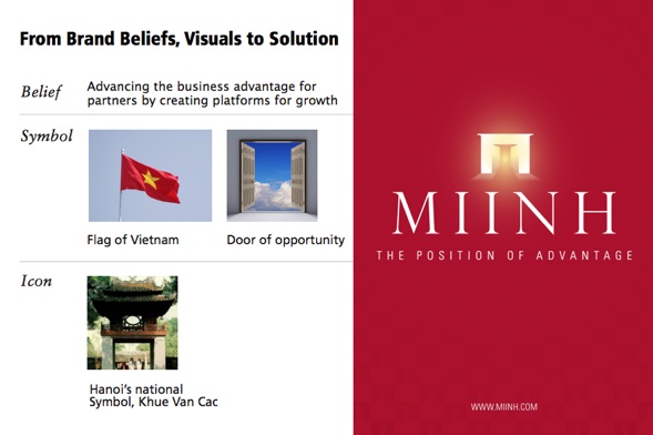
After a strategic review with the same Vietnamese company, the management agreed to having a new brand name and symbol which best express their role as a rising Vietnamese firm and a partner to help foreign companies set up in their country. The name adopted was the Vietnamese name Miinh, a word which has a strong reference to Vietnam with the typical “NH” consonant. Based on the earlier research, we decided to design the symbol inspired by the renowned pavilion and doorway Khue Van Cac in Hanoi. However, as logos have to be distinct, we could not simply draw the pavilion in the same way. Therefore, it was crafted to appear more like an ‘M’ and presented like a shining gateway. The fonts chosen were meant to give it a sense of professional weight.

The brand beliefs and visual board which led to the design solution on the right. PHOTO CREDIT: Consulus
3rd step: For adoption, you need advocates as a logo cannot speak for itself
At the end of the day, a logo cannot explain itself to others, it needs a sustained process of education. So the rationale of the logo has to be written and communicated with all staff. And every new staff has to be educated on the significance and meaning of the visual identity and why it is important for business. There has to be a disciplined process for its use just like how you would respect a national flag. We found that when companies have a process of respecting the use of their logos, their customers tend to appreciate the value of their brand.
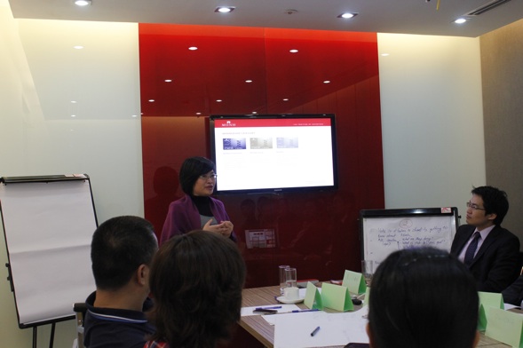
With the same Vietnamese company, we educated the staff on the meaning of the logo and put in place internal practices where they would share regularly. The staff would then share how they have reflected the brand’s identity and purpose in their work.

Vu Hanh Nga, General Director at New Peaks Real Estate Service speaking about the importance of new brand identity to the staff at their headquarters at Hanoi. PHOTO CREDIT: Consulus
This form of internalisation helps to raise the logo from a point of being a signage to becoming a relevant and influential symbol. The company also takes every opportunity to share with others the meaning of their logo. All these initiatives make it easier for staff and customers to believe that their company will really be one of the few that can represent Vietnam in the world.
Lawrence Chong is the CEO of Consulus, a company specialising in helping Asian firms rebrand and redesign their organisations to be more innovative through business design.


