If you have ever stumbled upon a website that opens with a lengthy animated sequence, plays music all of a sudden, and has animations for every action that you take, you probably understand how annoying that can be. Such Flash-based sites have become increasingly irrelevant due to the popularity of mobile internet surfing. iOS devices do not support Flash, and such sites will not load on them. Instead of helping business, these flashy sites actually hurt the business with their lack of usability.
Utility should trump attractiveness. A 10-second introductory ‘sales pitch’ that stands between users and what they are searching for may be an appealing compromise to many Sales and Marketing managers, but I am sure that many web users choose the ‘skip intro’ option, myself included. Below are four principles that apply to any business in terms of delivering a positive user experience online.
Remember who you are selling to
When designing your online presence to increase sales, it is tempting to create a site that caters to everyone. The internet by nature caters to every need, and a low barrier to entry gives businesses the power to potentially reach across the globe and make a sale. However, just like a physical retail store, it has to cater to your target market. The first thing that improves the user experience of a website is to remember the 80/20 Rule (The Pareto principle).
The Pareto principle (also known as the law of the vital few) states that 80% of the results comes from 20% of the causes. This is the basic rule of thumb in business (“80% of your sales comes from 20% of your clients”), but it can also be applied to web design. Dramatic improvements can often be achieved by identifying the key minority of your users, customers, activities, products or services that make the majority of your profit and maximising the attention paid to them. When we designed BIBD’s new site for them, one of our earliest questions was “Who would be using the site most often, and for what?” With that in mind, we began to design the site around that user.
Understand what the user wants
The internet phrase tl:dr (too long: didn’t read) came about because users are inherently very impatient and lazy when searching for information online.
This is because of how we react and think. The less effort it takes to get to what we are searching for, the better the site is perceived to be. In more technical terms, the higher the cognitive load and involvement required of the user for navigation and search, the more likely the user will be to leave your site for alternatives. In order for your web users to have a positive experience with your site, it has to be designed in a way that fits what they are using it for.
This is why your site firstly has to be responsive. This applies both to user experience and also to technical aspects. As a general principle, the less the user has to wait for the site to load, the better the experience. This is why lengthy introductions and extended loading periods for image and effects-heavy pages are (thankfully) becoming obsolete, as they get in the way of the desired purpose of the user and their needs.

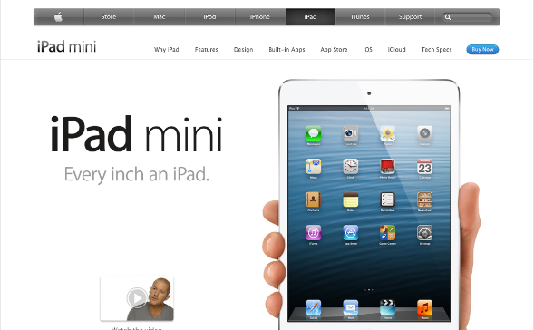
Apple’s site makes use of ample white space, and tucks away product information into a separate tab.
Do not bombard your users with too much information at the start. In general, keep things short. If you need to give product information to facilitate a purchase decision, keep it succinct and leave the more detailed information for another page. An example of this is the Apple site, where technical specifications are not displayed upfront but on a separate page, and core benefits to the user are the first things that are shown.
Design with the user in mind
Understanding the above principles allows you to design your site’s content to be more effective in closing a sale or at least in bringing the user one step closer to a purchase decision.
In most cases, users rely on their intuition to get around and on conventions or past experiences to make decisions. Users ‘satisfice’; they choose the first reasonable option available. As soon as they see something they think will lead them to the goal, they will click on it. This is why it is important to be clear in the experience design, to minimise the amount of question marks that the user will have. The clearer the navigation and descriptions are, the more likely users will find what they are looking for.
When writing for the web, give the user a summary of what the article is about at the start. According to research, a good style of writing should follow what has been done in journalism. This ‘inverted pyramid’ approach to writing starts with the conclusion to give readers an instant idea of what the article is about. This captures the reader’s attention and assures the web user that he has found the answer to his search. Since the web user of today wants instant gratification, only if your conclusion catches his attention will he then read on for more details.
Research by Nielsen Norman Group show that users look through a site in an F-pattern.
It is also important to note that users have been shown to have banner blindness. Anything that looks like an advertisement is almost always ignored. As users scan your site for information, they subconsciously filter colourful or animated banners as they assume those are ads. As a result, if you have a new product or something that you would like to promote, make sure that it fits your current design language and it is not placed in places where ad banners will probably be.
Do not be afraid of leaving empty space, as it helps in reading and comprehension of the content presented. Studies have found that a well-thought out use of white space between paragraphs and page margins increases ones’ comprehension of content by almost 20%. This is because cognitively, it is easier for readers to process well spaced-out content.
Also, do not be afraid to put content in areas that require scrolling. Past studies, like that of Jakob Nieslon, have shown that only a small percentage of users bother to scroll down. This has led to some sites trying to cram everything into the region above the fold (also called screenful). This area is described as the region of a page that is visible without scrolling.
However, behaviour has changed drastically.
Scrolling is much easier today with scroll wheels on almost every mouse, and on mobile devices, cramming everything above the fold makes for a wholly unpleasant, hard-to-read web page. Scrolling on such devices are easy and expected due to limited screen space. Recent studies prove that users are quite comfortable with scrolling and in some situations, they are even willing to scroll to the bottom of the page. More users are comfortable with scrolling than with pagination, and for many users, the most important information of the page isn’t necessarily placed “above the fold”. This has implications in designing your page with the user’s actions in mind; to ensure that your vital information is clearly communicated to the user.
Content is king
Designing the user experience has to follow good content. Research has shown that users can better remember characters, stories and facts that they had a personal experience with, and so sales content that uses testimonies, names and faces all tend to work better. Getting current customers to shout about your product on social media platforms such as Twitter, Reddit and Facebook, and giving clear links from these channels to your site also help to boost credibility and trust. For myVillage, we have also developed online campaigns that are easy for users to participate in, and so far our feedback has been rather positive.

myVillage encourages user participation with quick response compaigns that make use of social media.
Many sites now have mobile versions, which are stripped down versions of their desktop sites optimised to be more responsive on mobile devices. When paring down sites for use on mobile devices, do make sure that content is still easy to access, and core actions are still functioning and intact. This is essential in scaling a desktop version down to a mobile version.

The mobile site (L) still retains most of the core functions as the main site (R). Note the collapsed top navigation on the mobile site.
In conclusion, content is more important than the design that supports it. Users appreciate quality and credibility, and if your website provides useful and clear content, users will feel that the site is able to give them what they need. This is why we always design our web experiences to suit the content available. The design merely presents the content in a way that enhances its strength in creating buy-in, but poor content cannot be saved by slick design.
Roy Chen is a Senior Strategy Consultant at Consulus, who has worked with several companies in the region on strategic implementation of service and online experience design.
This article is part of The Columnist, a newsletter by Consulus that offers ideas on business, design and world affairs. For past issues, browse the complete archive.


